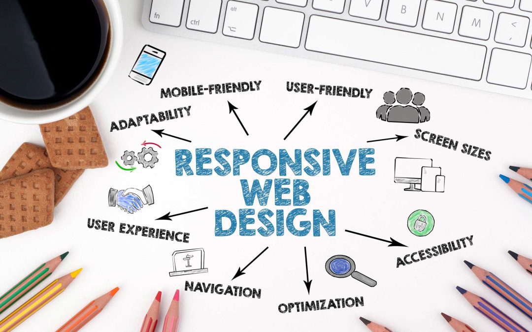
Since people browse the Internet on mobile devices, making a mobile-friendly website design is essential for any business website. A poor mobile experience can drive users away, leading to lost sales and lower search engine rankings. Responsible and mobile-first design ensures your website functions smoothly across all screen sizes—laptop, tablet, mobile, and more—promoting usability, speed and accessibility. In this post we’ll explore seven key trends and techniques that help create seamless, high-performing mobile experiences.
-
Fluid Grid Layouts
A fluid grid allows your website to adapt to different screen sizes by using proportional measurements instead of fixed units. Modern responsive designs use percentages to ensure elements scale based on the device’s screen size.
-
Flexible Typography & Scalable Media
Text and media must adjust to various screen sizes without losing readability or clarity. Responsive typography relies on relative units like em, rem or viewport width to scale text proportionally. This prevents text from appearing too large on desktops or too small on mobile screens. Images and videos should use CSS properties like max width: 100% to ensure they resize properly without breaking the layout. Scalable vector graphics (SVGs) are useful for logo and icons to maintain quality at any resolution.
-
Prioritizing Performance & Speed Optimization
Slow-loading websites drive users away, and large images, unoptimized code and excessive scripts can slow down a site. Techniques like image compression, lazy loading and minifying CSS and JavaScript help reduce page load times. Content Delivery Networks (CDNs) distribute assets across multiple servers to speed up access based on a user’s location.
-
Mobile-First Navigation
Navigation must be simple and accessible on small screens. Instead of complex multi-level menus, mobile-first design favors streamlined navigation options like hamburger menus, bottom navigation bars or collapsible sections. Buttons and touch targets should be large enough to tap easily, and adequate spacing between elements prevents accidental clicks and improves usability.
-
Progressive Web Apps
Progressive Web Apps (PWAs) combine the best features of websites and mobile apps. They load quickly, work offline and offer features like push notifications and home screen installation. Unlike traditional mobile apps, PWAs do not require app store downloads, reducing friction for users and offering a seamless experience even with poor connectivity.
-
Dark Mode and Adaptive UI
Dark mode has become a common feature in modern web design, reducing eye strain and conserving battery life on OLED screens. Websites can implement dark mode using CSS media queries to detect a user’s system preference. Adaptive UI design allows users to switch between light and dark themes manually. Implementing theme toggles and ensuring color contract meets accessibility standards to help create an inclusive experience.
-
AI-Powered Personalization
AI-driven personalization can adapt content based on user behavior. Machine learning algorithms analyze browsing habits to suggest relevant products, articles or layout adjustments. Chatbots and voice search integration improve mobile usability by offering quick answers without requiring users to navigate multiple pages. AI-driven design can also adjust font sizes, spacing and button placements in real time based on how users interact with a website.
Why Having a Responsive and Mobile-First Website is Critically Important
Nowadays, a responsive and mobile-first website design is more important than ever. If your website doesn’t meet visitor expectations through slow load times, poor navigation or a non-adjustable layout, they are more likely to abandon it and search for a competitor. Furthermore, search engines like Google prioritize mobile-friendly websites, meaning that a non-responsive site could negatively impact your SEO and online visibility. Mobile traffic now dominates the Internet, so don’t let a non-responsive website put you at a significant disadvantage.
Responsive, Mobile-First Websites from J Drake Website Design
J Drake Web Design specializes in creating mobile-friendly, responsive websites that prioritize speed, usability and seamless functionality across all devices. Our team understands that mobile users expect fast load times, intuitive navigation and a visually appealing layout.
We ensure that your website looks great and performs flawlessly on any device. Every website we built is tailored to your audience, with mobile-friendly navigation, touch-friendly elements and optimized content layouts. We also focus on performance to enhance user engagement and convert visitors into customers.
Whether you need a new website or a redesign to improve mobile responsiveness, J Drake Web Design provides customized website design solutions. In addition, we offer search engine optimization, web hosting and digital marketing to enhance your visibility on the web.
Contact J Drake Web Design today.